sister starborne
Essence: Authentic, microcosmic, ethereal, personal, feminine.
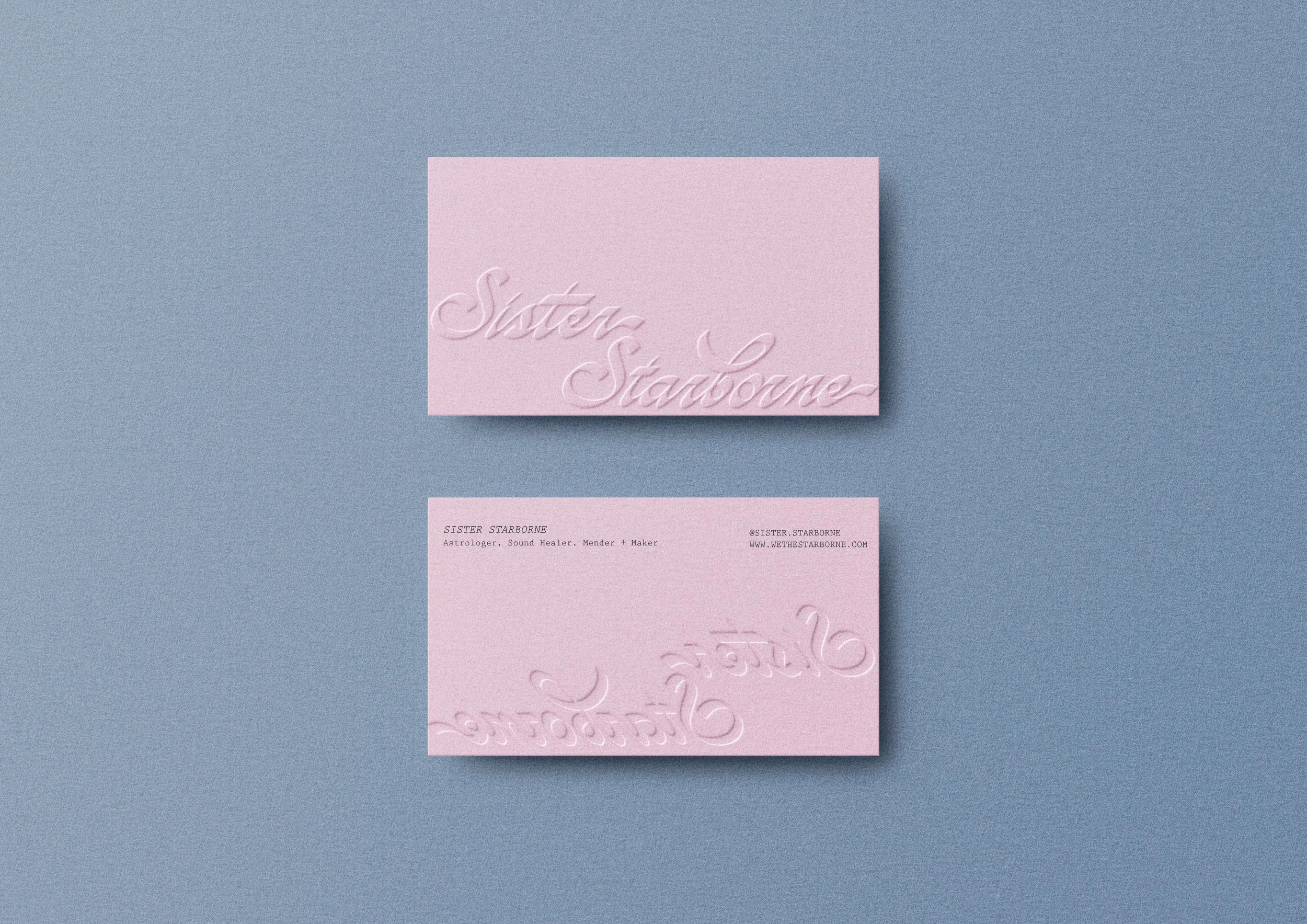
Sister Starborne
Services
Branding + Identity
Overview
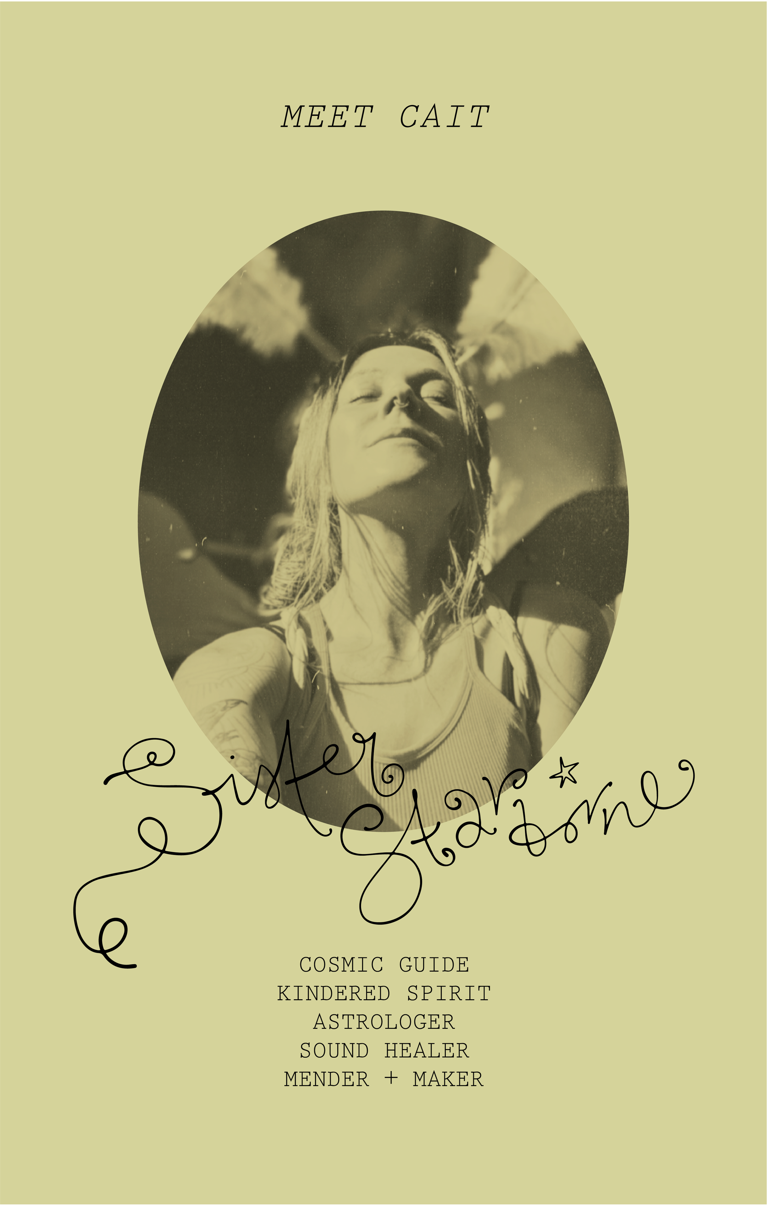
Sister Starborne is the creative persona of Cait Gottschalk, owner of We The Starborne. Through this name, she offers celestial guidance, hand-stitched spells, sound healing, and more.
The Brief
Build two brands that act like sisters– of the same universe, but each unique. We The Starborne is to act like the big sister; a more androgynous, structured retail brand, the gateway to an unexpected world. Sister Starborne, the secondary brand, is the more feminine little sister. Meant to describe the services and talents of Cait; the owner of WTS and an astrologer, sound healer, and maker.

OUR APPROACH
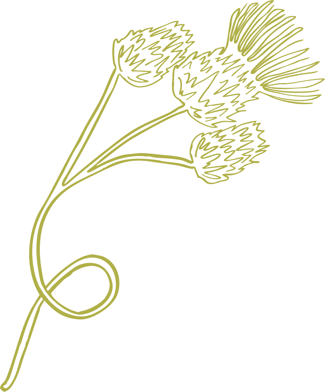
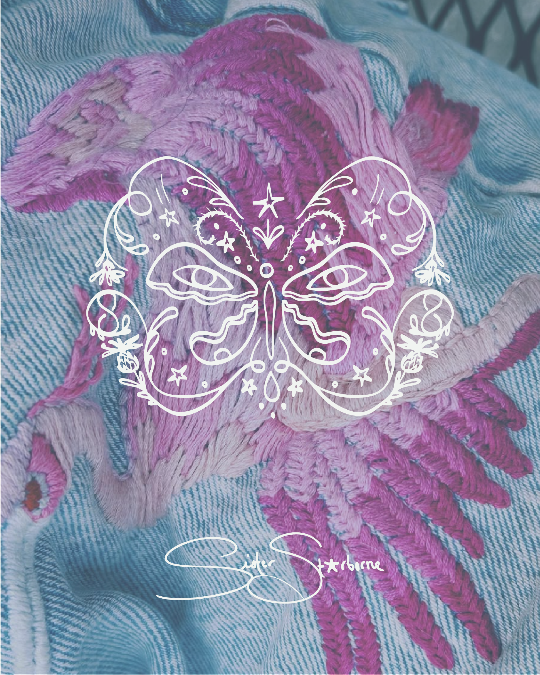
Odd and otherworldly, we sought to capture Sister Starborne primarily through a symmetrical emblem containing symbols of prominent meaning. Butterfly wings, the uterus, and thistles, all a part of Sister Starborne’s heritage and practice.
We chose a balance of handwritten signatures with script fonts, and a delicate typewriter to round the palette out. Celestial florals inspired the palette, with a range of pinks, greens, and blues that often show up as a theme in Cait’s work.

wearable spells from a kindred spirit.